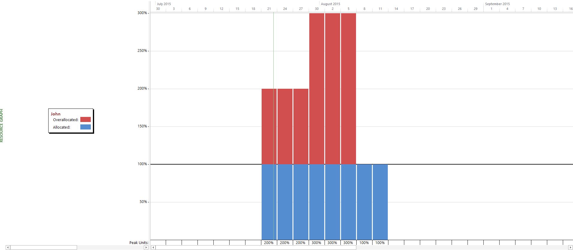
If the resource name is listed in red, then the resource is over allocated. Resources listed in black are allocated either exactly at or under their full capacity. Peak units are listed at the bottom of the graph.


Get your own template
In our e-course you get a template in which we have made a small adjustment by creating a combined resource graph. This graph combines the resource sheet with the resource graph. The main difference as opposed to the default graph is that you can now select multiple resources at once and see their combined availability and workload. Don't be afraid to send us an email or give as a call so we can help you to set this view up for yourself!Try it yourself
Test it out for yourself by selecting multiple resources and try out the different sections in the resource graph that you will see once you right-click on the graph area.
